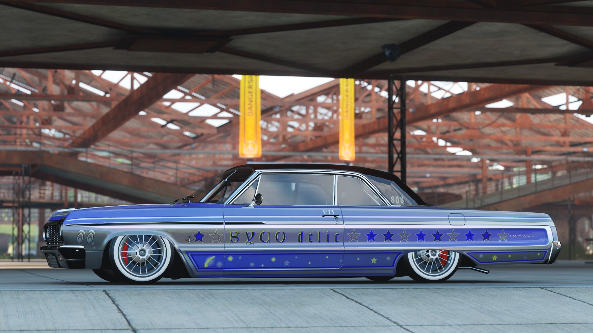
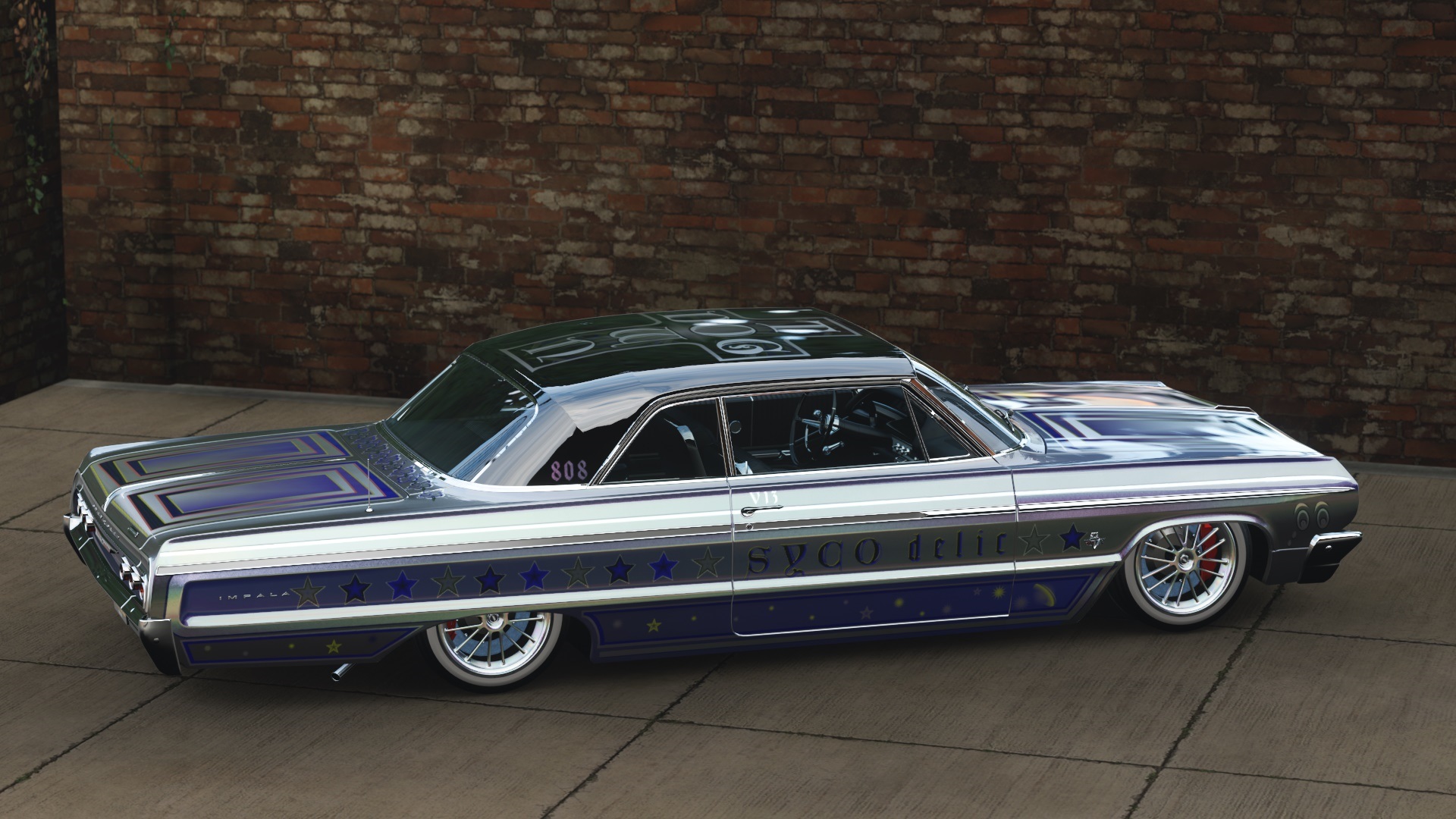
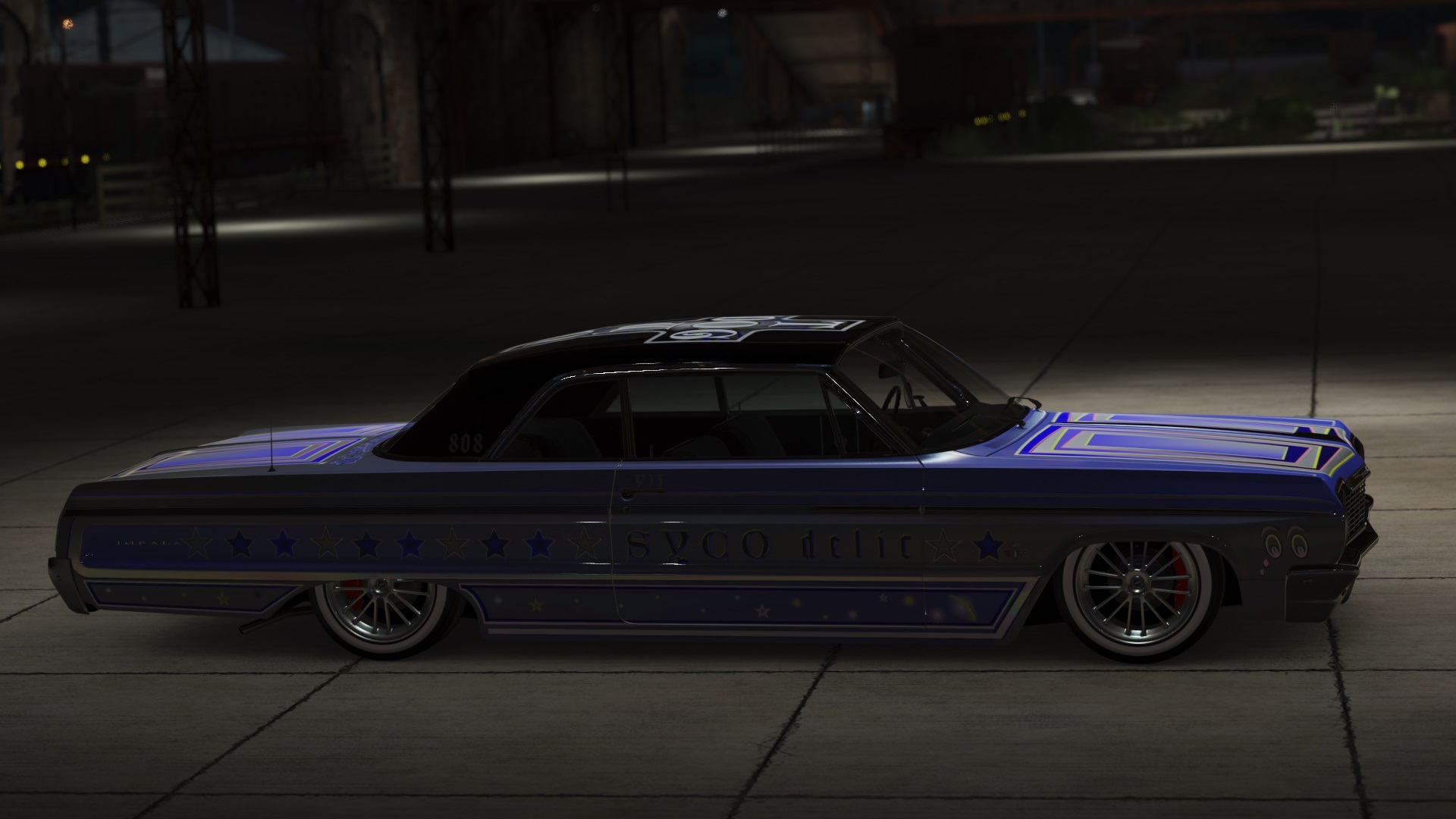
This is just the latest iteration of a paint I have spent a lot time on, doubt if it will ever really be “done”. I have been working on getting the paint to shift as the light changes. Design features lot of symbols from my youth, some obvious, some not so obvious.
Comments welcome, and curious to see other painters lowriders.
1 Like
Total awesomeness. Overall cohesive, flowing design and a lot of detail. I dig the cross on top, the font is cool as, and the depth/shapes inside the cross below the font really make the difference. And I am the same way… I work on a design for days, sometimes weeks and have a hard time determining when it’s “done”. I’ll upload a design then be like, dang I should add this or that…
Not my particular style but for what it is, everything lines up perfectly. There’s no vinyls that cut against the natural lines of the car, that progressive layering on the cross makes it pop, and the stripes are aligned perfectly flush from center. I can’t spot anything I could criticize. Nice work!